Showing posts with label Oscar Olsson. Show all posts

Saturday, 4 June 2016

Our design - Prototype to Final

Our design started to take its final form after the Expert and Heuristics evaluations. We now started to sketch on our prototype as seen in the blog post:

We used Invision as our tool to design the prototype.

Although we didn't set out to use an evaluation framework like DECIDE, and despite the linear progression of the course's exercises, the nature of the design process forced us to go back and iteratively re-evaluate our work and assumptions — especially the Exploration of questions and Determination of goals. Coming at these iterations with different assumptions and from new angles enabled us to triangulate our users and their needs.

Since the course didn't go beyond a basic (though high-fidelity, and without much horizontal or vertical compromise) digital prototype, it didn't have enough interactivity to meaningfully apply any GOMS model or investigate Fitt's law. We also didn't do any dedicated gathering of statistics from our users or evaluators in form of questionnaires or such. Which in turn means that nearly all of the data that informed our iterations was qualitative.

Furthermore, although we recognize the usefulness of user-centered design and making the users active stakeholders — especially in the face of having our assumptions changed/expectations managed by both the interviews and the think-alouds; what actually transpired was mostly what we'll humbly refer to as genious design. But an argument could be made that we were ourselves prospective users of the final product. This is especially true in the case of group members who had not been present during the creation of the app, who gave the group feedback from walkthroughs which resulted in several new functionalities being added.

We used pen and paper for our low-fidelity sketches, and used InVision as our prototyping tool for the final prototype. The GUI for the app reuses established mobile interface norms. 

An example of the iteration process for specific icons is seen in this blog post:


Our train icon combines similarity of the train shape with an analogy between available seating and colour (green is free, red is occupied). We also use the arbitrary but commonly established symbolism of a pointing arrow for "exit".

http://f5slattarna.blogspot.com/2016/06/proposed-changes-to-physical-metro.html

Our updates to the stations are static, but of course the users can interact with them — by choosing to read/look at them and choosing how much of their information they take in.

Here is a short summery of what the final design does:


  • Add more points of interest to the exit signs.
  • Make sure that all exits are color-coded.
  • Use color coding to show the different exits on maps on the stations.
  • Make the color coding clearly visible to the commuters, use lines/dots/arrows to guide them to their desired color.
  • The lines/arrows should guide users to their destination, improving the general people flow and reducing crowding.
  • Integrate the color coding system in the SL-App, it should tell users what exit color they should take.
  • On bigger and more complicated stations, add extra detail to the color-coding system, (inspired from Hong kong), using letters or letter-digit-combinations (A1, A2, etc). Same colors should be together however, to make it easier to find for the users.
  • Also let the SL-App tell users where they should sit on the train. It should inform
    • Where to sit that is closest to your exit
    • Where to sit if you want to avoid crowds.


Wednesday, 1 June 2016

Look how far we've come...

Design process starting from field studies.

To sketches of app and of adjustments to physical metro stations.

To a finished prototype! Click it!


Seriously, click it and check out the interactive prototype!

Proposed changes to the physical metro stations

Not all solutions are digital. Accompanying our app are these proposed changes to the physical metro stations:

The signs on the platforms (and at the entrances, not shown in picture) should include colour codes for the exits they inform of (the triangles). They could also incorporate more nearby locations of interest.

 
 Exits shown on maps should also have the colour codes. The encoding should be consistent between stations, for example always having pink exits in the forward direction of the trains toward one end station.

 Here's an early attempt at guiding the passengers to their exit. Can you spot all the flaws?

1) Guides on the ground won't be visible during rush hour when the platform is crowded. 2) Guides leading out from the doors will cross over each other ad nauseam. 3) A line of undirected guides might be seen by a traveller who then proceeds to walk in the wrong direction. 4) Round coloured guides is the established symbol for the metro lines, which would be confused with exits.

Crowding information for the oncoming train could be shown to everyone on the platform. (The picture is from a KTH study that tried doing exactly that.)

Friday, 27 May 2016

Creating our train icon

We need an icon for our app. The icon should show which section of the train is nearest the user's exit. The icon should also show how crowded the different parts of the train are.

So we need a symbolic representation of a train, an exit mark for that train, and a way to mark crowding in that train.

This symbolic representation should ideally show all the wagons and all the doors.
  • So that it becomes clear for users exactly where to go for available seating.
  • So that it's possible to indicate "short train" by removing a wagon from the icon.

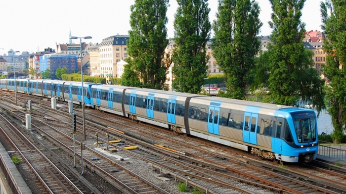
This is a Stockholm metro train:
00 train.jpg

Below is a drawing of the rough proportions of the full metro train, with the standard set of 3 wagons and each wagon with 3 sections. 21 door pairs in total on one side:

01 longtrain.jpg
"I'm barely 2-dimensional! Choo-choo!"

If the above drawing would be shrunk down to fit in the app, it would look like a horizontal line. We have to change the proportions of the wagons to make the full icon recognizable as a metro train. 

When squashing the train horizontally it won't be possible to keep the details of all the doors and windows as was initially desired. Instead of 2-3 door pairs and 5-6 windows per section we'll reduce it down to 1 door pair per section and 1 window on the side of each entrance:

02 train.jpg


That’s not too far off what the real wagons look like. In the app we have about 320 pixels to fit the three wagons in:

03 tinytrain.jpg

That's still too long and thin.

The existing icons in the app (below) are 25 pixels high:
  04 other icons.jpg

So the proportions of the train needs to be about 12:1, making each wagon about 4:1:

05 loltrain.jpg

And let's simplify it further to the style used by the existing icons:

06 lineart.jpg

There we have it, now to join them together and mark where the ideal exit is:

07 full lineart.jpg

And we colour the exit arrow to the colour of the station's exit as a way to give additional information (accelerator) to expert users:

08 full lineart colored.jpg

And add a heatmap gradient of how crowded the train is:

09 full lineart colored heatmap.jpg

That heatmap is very visible, but it overpowers the visual symbol of the train. Let’s try to tone the heatmap down, keeping it strongest at the floor of the train where the people are actually standing and sitting:

10 full lineart colored heatmap diskretare.jpg

The colour palette of the heat map and the shape of the exit arrow was further adjusted to better fit when placed in the app, as can be seen in the prototype.

Monday, 2 May 2016

Summary of Think-Alouds


Everyone used a similar usability test on the prototype in form of answering:
Find the way from T-Centralen to Södermalmstorg using the prototype.

Some main comments from the think- alouds were:
-          App is clear. But there might me some frustrating excessive confirmation.
-          The crowding information should be on the platforms as well.
-          The red and green text should only be green at the word “red” and “green”.

Some of the most emotional reactions from the users of the prototype was that it was working or dong things for you that the “real” app does not. Maybe the prototype was too simple in to get focus on the main features.

The tests was done in a fast mention and without any longer breaks which might indicate that the app doesn't require the highest level of counciouss decisionmaking that interferes with spoken language that Gulan mentioned on his lectures.

The users understood quickly that the trains indicated crowding information but not in which way. The question mark, showing further information of the train icon, was in some case spotted and used but in others not used.  In the case where it was used the reaction was that it was understandable.

For our final design we should probably change the information in the app based on the feed- back and also change the symbols used for lines and exits (discussed in the “övning 5”).

Individual think-aloud

Female, 20's, technology-savy, on-and-off metro commuter:

So I'm at T-Centralen and I'm going to Södermalmstorg...

I'm not absolutely certain where Södermalmstorg is, so I open the SL-app, it knows where I am and I input "Sodermalmstorg". I only have to input "sö" and tap the correct suggestion, easily done.

Given that it uses locations known to the app, I feel that I should not have to confirm the route again, but that's fine.

I get suggestions of arrangements for my route, and I pick the first one without thinking about it further. Perhaps I'm slightly frustrated by the previous seemingly excessive confirmation.

I see that I'm supposed to take the red line, so I look up from the app and make sure that I'm walking in the right direction.

Having spotted a sign with a red arrow directing me to the platform for the train towards Norsborg, i return my gaze to the app.

I see that I want to be toward the left side of the train (as viewed from the platform), to disembark nearest to the pink station exit. I return the phone to my pocket and continue walking toward the platform.

I arrive at the platform and see that the trains toward Norsborg are on my left. This means that I want to sit in the opposite end of the train, so I start walking along the platform.

I look at my phone again to make sure that I'm not mistaken. I never closed the SL-app so it's still showing me the same route arrangement. I see that it had indeed indicated the left side of the train. Pink exit — that bit I remembered more clearly.

I notice that the coming train is crowded near my exit, which makes me less motivated to keep walking toward it. I'm at mid-platform and there should be some seats there on the train, so I stop and wait the remaining minute before the train arrives. Sitting, if only for about 5 minutes, will be nice.

I close the app to read some mails, making a last mental note: Pink.

Friday, 29 April 2016

Seminar 2 - Summary

Recollection of discussed topics during seminar 2

  • We have learned the importance of evaluating, but sometimes it is hard to user-test something beforehand (scale, patents, secrecy). We also discussed ways to circumvent this.
  • For testing our own design, we could use testing in the wild: adding markers and prototypes to the SL stations, and have people try to accomplish tasks (getting from A to B while using our prototype app). This would be testing in a natural setting involving users.
  • We could use people from Copenhagen (which has a similar system in place) to heursitically evaluate our prototype and tell us what they feel are the good parts and bad parts of our system when it is adjusted to Stockholm.
  • We could also take Stockholmers to Copenhagen and let them see what they like and don’t like about that system, and see how they compare it to stockholm.
  • This would be be a kind of triangulation: we see the problem both from the perspective of users who have used it for a long time, and users who are using it for a first time. Their combined heuristics would give us a better view of the actual good and bad sides of our idea.
  • Also, Opportunistic Evaluation is a thing that we can actually, practically do (not assuming infinite resources etc). We could even ask the group we’re presenting to what they think, since they are almost surely users of the public transportation. We can also interview people in the subway and present our design to the, ask what they think.
  • We discuss how we should evaluate the different parts of our designs, since it is quite broad. It might be good to evaluate each part on its own, ut we also need to evaluate the whole together since we need to know how well the prats cooperate.

Wednesday, 13 April 2016

Design step 2 - Parallel design

For the second part of the design step we split into two groups, we were given the same pain point with the goal to create a design centered around it. The chosen pain point was: Being unsure on what exit to take. We gave it about 40 minutes before sitting down to compare the designs. To our surprise, both managed to create very similar designs, both featuring an application with some modification to the station.
Low-fi prototypes of both designs

Both groups had used the existing SL-app as a base for the design and then expanded on it. With the pain point being what exit to take, we had the idea of colouring or assigning a letter to the exit so that when looking at your planned route, you could easily see what exit to take. Using colours to distinguish between the exits allowed us to use the already existing "T" that people are used to seeing. As it is something familiar to the user and as such, takes little getting used to.


When it came to making changes to the actual station we were basically on the same page yet again, changing the signs to reflect what exit they point at (pink, grey, blue, A, B). One group also had the addition of arrows on the ground that you could follow to the exit. The visibility and if it's easy to find your arrow when there's a lot of exits or on a crowded platform is something to consider.


Detailed exposition of the design progress in group 1

First we considered the situation when a traveller arrives at a platform, and tries to figure out where to go.


We noted that there are signs at the ends and in reasonable intervals along the platforms. These signs describe the exits by street name and occasionally also by important locations in the direction of the exit. Unfortunately these are often insufficient e.g. if the traveller is heading to a parallel street or further away.


The most straightforward improvement would be to add a longer list of streets and locations for each exit. It occurred to us that sometimes travellers don't know any of the nearby street names but only which general direction they want to exit. It therefore seemed appropriate to have maps rather than signs naming streets.


Each of these maps would show all the exits and the nearby surrounding area. Nearby streets and important locations could also be named in the map.


The exits marked in the maps should be colour-coded, perhaps using textures or multiple colours each to make them unique and distinctive. These distinctive colours could then be used to mark or point to exits throughout the station.


Distinctive arrows could be put at each intersection, or lines could be drawn all along the floor. It was noted that floor lines could be obscured during rush hour. It was also noted that coloured arrows could be confusing if seen by themselves without a map, but this did not seem like a major issue since maps would be at all entrances and at intervals on the platforms. Furthermore, in places where there's no place for a map, where today there's only a sign that names the street the exit opens up to, in those places the same street could be named in addition to the colour coding of the sign.


Next we considered the situation before a traveller arrives at a platform — ideally they want to exit the train onto the platform nearby to the exit they want off the platform, and for that they need to know where they should position themselves in the train well before arriving at the platform. The best time to make use of this information is before entering the train, while waiting for the train to arrive.


It seemed unreasonable to have all this information displayed statically at each station, i.e. all stations having the map described above for their exits, as well as those maps for every other station on the line (and connecting lines). It did however seem possible to have this information in a dynamic application.


To investigate this we looked at an existing SL schedule app. The app, much like the SL webpage, lets you input start and target destinations, along with planned starting time for the journey, and then it shows you a chronology of evens: Walking to the nearest relevant station, what line to take, when the train will arrive, how long the journey will be, which station to exit on.


In the existing layout of the app it seemed fitting to add a suggested wagon to board (i.e. which end of the train, or sometimes middle). Another good addition would be on the exit station to say which colour-coded exit to head for.


The app lets the user see more detailed information about some items in the chronology by tapping an expansion arrow on such items. Continuing this interface the indication for which wagon to take could be an iconified train with three wagons (as seen from the platform), with the recommended wagon to take marked. For new users who don't understand this icon an expansion arrow could be tapped to show an explanation.


If there was a way to measure real-time seat-availability and/or general crowding in the wagons, this information could be used to improve the wagon recommendations.

We realised that navigating by colour-codes rather than Swedish street names would be especially useful for tourists. Unfortunately tourists would be especially unlikely to have an SL route app. This could be solved by having tourist information at station entrances together with WiFi enabled downloading of the app, or by placing touch-screen interfaces to the app on stations.

Wednesday, 30 March 2016

State of the art analaysis - Summary


Doing our state of the art analysis’ we had a broad perspective to try gather as much diverse and useful insights posible to what might be useful for our own project. This made ofcource that common ground for all of them was hard to find but a few topics that was brought up in most was regarding information.

            What information are available for the user?
            Is the information easy accessible?
            Is it well presented?
            Is it useful?

A repeated opinion during the interviews was the frustration when forced to make a choice without any information i.e. when there’s major delays, should one wait for the train or try an alternate itiniary, if so which one? Two of the state of art analyses regarded interaction design based on real-time information and both have shown good results in user satisfaction. The information is often times already acessable for the designers such as precise locations of transport because necessary technology is already in place. The issue lies to transform the data to a user oriented purpose. The most critical information for users must be accurate and easy aviable.

It might also be fair to compare the SL app to more generalized travel applications such as Google maps. What SL lacks is the integration of other means of travel such as riding a bike to the train and when leving the train show a map to the destination wished for. To make the app useful doing things that naturally combines with travel might increase satisfaction with the app.

Tuesday, 29 March 2016

State-of-the-art analysis

Meatspace metro signage.

The non-digital information present in the metro, specifically static or machine-generatable information. I have divided this into five categories:

Information about gaining access to the metro.
  • Street-level:
    • Street signs, T-symbols, sometimes metro line colour.
  • At entrance points:
    • How to pay for and use tickets or passes.

The pass vending machines, turnstiles, toll booth, as well as the passageways and stairs, are recognizable and well understood symbols by themselves. Much signage is not needed for where they are or their context of use.

The toll booth, when staffed, is of course potentially a near endless source of information. In fact any human present—employed by the metro or not—has that potential, but such sources are outside of the scope of this analysis.

Information about using the metro.
  • System/station maps at the entrances, platforms and inside the trains.
  • Station names and exit guides at the platforms, somewhat visible from inside the trains.
    • Also signs about platform inter-connectivity.
The platforms, safety lines drawn on platform edges, benches, rubbish bins (and often clock) are—as above—of well understood purpose.

Dynamic information about metro events.
  • Displays show:
    • Wait time for upcoming train. Sometimes scrolls wait times for several.
    • Destination/end-station for upcoming train(s).
    • If the arriving train has few wagons/is short.
    • Ad-hoc information, typically about delays.
  • Speaker on platforms informs about delays and other ad-hoc messages.
  • Speaker in trains informs about station stops and ad-hoc messages.
The trains are very visible, and they are—including their doors and seats—of well understood purpose.

The information in the display is sometimes animated/scrolling, which during a long wait on an empty station is the only thing that confirms the passing of time.

Safety and regulation, e.g. notes about "keeping off the rails".

Advertisements.
  • Large billboards facing the platforms (some stations).
  • Medium billboards on the platforms (some stations).
  • Ad-space along the top of the windows inside the trains.
  • On vending machines (some stations).
In some stations the advertisements are given more area than all the rest of the signage put together. The advertisements are also typically the most attention-grabbing. It's also the only information that is not there to help the travellers in using the metro. This brings into question the non-functional requirements of the metro.

If revenue (on top of government subsidies and ticket fee) is sought, then more ads could easily be played over the speaker systems on platforms and in trains, and ads could be interspersed in the scrolling display about upcoming trains. It would also be easy to install screens (with sound) in the trains that show tv-ads, as is done in some other countries. Of course the average user would balk at such changes, claiming it to be too intrusive, but after a few years it would become the new normal.

On the other hand, if revenue for the metro was not the goal of the service, then these spaces could be used for something that benefits the travellers: practical information and/or art.

Non-functional requirements for metro signage.

The metro is a core component of city infrastructure, therefore the signage should be:
  • Reliable 
    • Must never give wrong information about critical information such as delays.
    • For sub-critical information it should at least be accurate enough to gain users' trust. 
  • Tamper proof/unexploitable 
    • For the above reasons. 
  • Sturdy 
    • For the above reasons since the metro can be a harsh environment. 
  • Maintainable 
    • Specifically day-to-day maintenance should be limited to cleaning (see Sturdy), and repairs should be quick/modular. 
  • Accessible 
    • Must be usable/understandable by an extremely wide audience, including disabled, tourists, and disabled tourists. 
  • Unobtrusive 
    • Users should be free to their own agency to make productive use of their time on the platform and in trains.
    • Unless ads are a functional requirement.

Field study, interview transcript


Route: 6, T-centralen <—> Slussen.
Target group: Frequent travellers.
Method: semi-structured interview.
Place: Gamla stan metro station.
Time: Mon 22 feb, forenoon.

I geared up with half a bag of individually wrapped candies (fruktkolor, tveksamt aptitliga), and a sign taped to the bag stating:

"Ta en kola, svara på en fråga." (Have a taffy, answer a question.)

Thus armed I positioned myself on the metro platform, knowing that everyone who would enter or exit a metro car would be travelling on our chosen route.

Moving along the platform I first targeted preadolescents, hoping that they would not be too self-important to reject gifted candy. (But at the same time being mature enough to reject what their parents had told them about such gifts from strangers.)

As their grubby little paws clutched a taffy, older travellers observed and accepted this social norm, making them more approachable in turn.

My one question to all travellers was: "How often do you take the metro to-or-from Gamla stan?"

This was my demographic test. If the answer was every week or more, then as they caressed the wrapping of their gifted taffy, I would continue with: "Great! I'm doing a survey for a course in KTH and you're exactly who I'm looking for. Can I ask you 5 more quick questions?"

This procedure goes against the course literature's suggestions of starting by presenting the interviewer and the goals of the interview, providing informed consent and reassuring the interviewee about ethical issues. But on the upside I did not waste their time and they all seemed happy or at least content. (I did not even briefly waste the time of people who declined answering my questions, because no one declined, thus no non-response bias.)

Junior-school boy 1.
How often do you take the metro to-or-from Gamla stan?
Only when I'm going to Jesper. [How often is that?] Depends, perhaps every week? We usually go to my place.

Junior-school boy 2 (Jesper).
And how often do you take the metro to-or-from Gamla stan?
Every day, almost. To school and such. [Morning and afternoon then?] Yeah.

Great! I'm doing a survey for a course in KTH and you're exactly who I'm looking for. Can I ask you 5 more quick questions?
Yes, ok.

Where do you usually stand on the platform?
Not too close to the edge. [Haha I meant along the platform, near the entrances or in between.] Oh I usually walk over here because it's where I should exit [from his exit station].

What do you usually do while you're waiting for the metro and while you're in the metro train?
We're usually talking, or I'm using my mobile. (Junior-school boy 1: And games.)

Do you have the SL mobile app?
Yes. [Do you use it?] Not really.

What do you like about the metro?
I don't know. You can go to different places.

Anything you don't like about it?
When you have to stand up.

Senior man.
How often do you take the metro to-or-from Gamla stan?
Oh it adds up, often enough. [So pretty much every week?] Yes.

Great! I'm doing a survey for a course in KTH and you're exactly who I'm looking for. Can I ask you 5 more quick questions?
Do I get 5 more taffies? [Haha we'll see.]

Where do you usually stand on the platform?
At my age you see... I usually walk until I find a bench.

What do you usually do while you're waiting for the metro and while you're in the metro train?
It depends, sometimes I read Metro, sometimes I have something else with me.

Do you inform yourself about anything before or while you are using the metro?
What's that? I don't understand. [What information do you look at to help with your trip?] Oh I don't make any great plans for taking the metro. [Do you look at the signboard above the platform?] Oh yes of course, and I listen to the speaker and the announcements on the train. *Looks around searchingly* And I use the maps when I'm going far. Mostly to see how many stops it'll be.

Do you use the SL mobile app?
Yes, I have it. [Do you use it?] I suppose I could use it more.

What information about the metro would you like to have?
If there are any problems and if there are delays.

Woman, late 40's.
How often do you take the metro to-or-from Gamla stan?
2-3 times per week.

Great! I'm doing a survey for a course in KTH and you're exactly who I'm looking for. Can I ask you 5 more quick questions?
So you're just asking some questions. [Yes.] Ok.

Where do you usually stand on the platform?
Depends on where I'm going. I don't like it when the train's are short.

What do you like about using the metro?
It's convenient. Many stops in the inner city, and gets you far into the suburbs. You don't have to wait too much.

Does anything bother you?
Yes! Let's see. They are really noisy, I mean the wagons but the people too sometimes, and it's never really clean anywhere, just icky. They haven't really made any newer wagons for ages. Is that what you are doing, in KTH? [This project is looking at ways to improve the information in and around the metro.] That's good. [Anything else that bothers you?] Yes but I can't think of it right now.

How about things that worry you when you are using the metro.
I don't use the metro at night, at such times I'll take a taxi. [Why?] Well you don't know who's hanging around here then.

What do you usually do while you're waiting for the metro and while you're in the metro train?
These days reading on the mobile is common.


I talked to one more person but didn't transcribe it and promptly forgot most of it.