We need an icon for our app. The icon should show which section of the train is nearest the user's exit. The icon should also show how crowded the different parts of the train are.
So we need a symbolic representation of a train, an exit mark for that train, and a way to mark crowding in that train.
This symbolic representation should ideally show all the wagons and all the doors.
- So that it becomes clear for users exactly where to go for available seating.
- So that it's possible to indicate "short train" by removing a wagon from the icon.
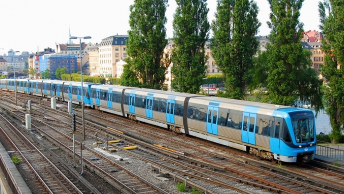
This is a Stockholm metro train:
Below is a drawing of the rough proportions of the full metro train, with the standard set of 3 wagons and each wagon with 3 sections. 21 door pairs in total on one side:
| "I'm barely 2-dimensional! Choo-choo!" |
If the above drawing would be shrunk down to fit in the app, it would look like a horizontal line. We have to change the proportions of the wagons to make the full icon recognizable as a metro train.
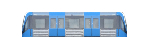
When squashing the train horizontally it won't be possible to keep the details of all the doors and windows as was initially desired. Instead of 2-3 door pairs and 5-6 windows per section we'll reduce it down to 1 door pair per section and 1 window on the side of each entrance:

That’s not too far off what the real wagons look like. In the app we have about 320 pixels to fit the three wagons in:
That's still too long and thin.
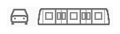
The existing icons in the app (below) are 25 pixels high:
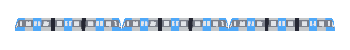
So the proportions of the train needs to be about 12:1, making each wagon about 4:1:
And let's simplify it further to the style used by the existing icons:
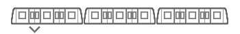
There we have it, now to join them together and mark where the ideal exit is:
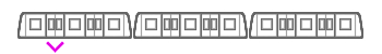
And we colour the exit arrow to the colour of the station's exit as a way to give additional information (accelerator) to expert users:
And add a heatmap gradient of how crowded the train is:
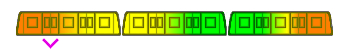
That heatmap is very visible, but it overpowers the visual symbol of the train. Let’s try to tone the heatmap down, keeping it strongest at the floor of the train where the people are actually standing and sitting:
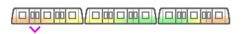
The colour palette of the heat map and the shape of the exit arrow was further adjusted to better fit when placed in the app, as can be seen in the prototype.
No comments:
Post a Comment