Not all solutions are digital. Accompanying our app are these proposed changes to the physical metro stations:
The signs on the platforms (and at the entrances, not shown in picture) should include colour codes for the exits they inform of (the triangles). They could also incorporate more nearby locations of interest.

Exits shown on maps should also have the colour codes. The encoding should be consistent between stations, for example always having pink exits in the forward direction of the trains toward one end station.
Here's an early attempt at guiding the passengers to their exit. Can you spot all the flaws?
1) Guides on the ground won't be visible during rush hour when the platform is crowded. 2) Guides leading out from the doors will cross over each other ad nauseam. 3) A line of undirected guides might be seen by a traveller who then proceeds to walk in the wrong direction. 4) Round coloured guides is the established symbol for the metro lines, which would be confused with exits.
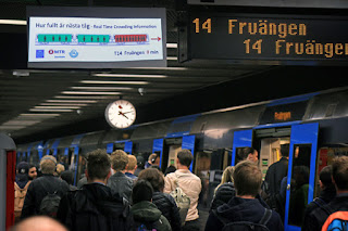
Crowding information for the oncoming train could be shown to everyone on the platform. (The picture is from a KTH study that tried doing exactly that.)


No comments:
Post a Comment