Saturday 4 June 2016

Our design - Prototype to Final

Our design started to take its final form after the Expert and Heuristics evaluations. We now started to sketch on our prototype as seen in the blog post:

We used Invision as our tool to design the prototype.

Although we didn't set out to use an evaluation framework like DECIDE, and despite the linear progression of the course's exercises, the nature of the design process forced us to go back and iteratively re-evaluate our work and assumptions — especially the Exploration of questions and Determination of goals. Coming at these iterations with different assumptions and from new angles enabled us to triangulate our users and their needs.

Since the course didn't go beyond a basic (though high-fidelity, and without much horizontal or vertical compromise) digital prototype, it didn't have enough interactivity to meaningfully apply any GOMS model or investigate Fitt's law. We also didn't do any dedicated gathering of statistics from our users or evaluators in form of questionnaires or such. Which in turn means that nearly all of the data that informed our iterations was qualitative.

Furthermore, although we recognize the usefulness of user-centered design and making the users active stakeholders — especially in the face of having our assumptions changed/expectations managed by both the interviews and the think-alouds; what actually transpired was mostly what we'll humbly refer to as genious design. But an argument could be made that we were ourselves prospective users of the final product. This is especially true in the case of group members who had not been present during the creation of the app, who gave the group feedback from walkthroughs which resulted in several new functionalities being added.

We used pen and paper for our low-fidelity sketches, and used InVision as our prototyping tool for the final prototype. The GUI for the app reuses established mobile interface norms. 

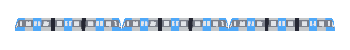
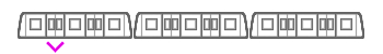
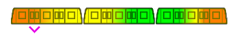
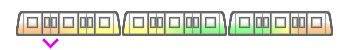
An example of the iteration process for specific icons is seen in this blog post:


Our train icon combines similarity of the train shape with an analogy between available seating and colour (green is free, red is occupied). 
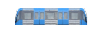
We also use the arbitrary but commonly established symbolism of a pointing arrow for "exit".

http://f5slattarna.blogspot.com/2016/06/proposed-changes-to-physical-metro.html

Our updates to the stations are static, but of course the users can interact with them — by choosing to read/look at them and choosing how much of their information they take in.

Here is a short summery of what the final design does:


  • Add more points of interest to the exit signs.
  • Make sure that all exits are color-coded.
  • Use color coding to show the different exits on maps on the stations.
  • Make the color coding clearly visible to the commuters, use lines/dots/arrows to guide them to their desired color.
  • The lines/arrows should guide users to their destination, improving the general people flow and reducing crowding.
  • Integrate the color coding system in the SL-App, it should tell users what exit color they should take.
  • On bigger and more complicated stations, add extra detail to the color-coding system, (inspired from Hong kong), using letters or letter-digit-combinations (A1, A2, etc). Same colors should be together however, to make it easier to find for the users.
  • Also let the SL-App tell users where they should sit on the train. It should inform
    • Where to sit that is closest to your exit
    • Where to sit if you want to avoid crowds.


Wednesday 1 June 2016

Look how far we've come...

Design process starting from field studies.

To sketches of app and of adjustments to physical metro stations.

To a finished prototype! Click it!


Seriously, click it and check out the interactive prototype!

Proposed changes to the physical metro stations

Not all solutions are digital. Accompanying our app are these proposed changes to the physical metro stations:

The signs on the platforms (and at the entrances, not shown in picture) should include colour codes for the exits they inform of (the triangles). They could also incorporate more nearby locations of interest.

 
 Exits shown on maps should also have the colour codes. The encoding should be consistent between stations, for example always having pink exits in the forward direction of the trains toward one end station.

 Here's an early attempt at guiding the passengers to their exit. Can you spot all the flaws?

1) Guides on the ground won't be visible during rush hour when the platform is crowded. 2) Guides leading out from the doors will cross over each other ad nauseam. 3) A line of undirected guides might be seen by a traveller who then proceeds to walk in the wrong direction. 4) Round coloured guides is the established symbol for the metro lines, which would be confused with exits.

Crowding information for the oncoming train could be shown to everyone on the platform. (The picture is from a KTH study that tried doing exactly that.)

Friday 27 May 2016

Creating our train icon

We need an icon for our app. The icon should show which section of the train is nearest the user's exit. The icon should also show how crowded the different parts of the train are.

So we need a symbolic representation of a train, an exit mark for that train, and a way to mark crowding in that train.

This symbolic representation should ideally show all the wagons and all the doors.
  • So that it becomes clear for users exactly where to go for available seating.
  • So that it's possible to indicate "short train" by removing a wagon from the icon.

This is a Stockholm metro train:
00 train.jpg

Below is a drawing of the rough proportions of the full metro train, with the standard set of 3 wagons and each wagon with 3 sections. 21 door pairs in total on one side:

01 longtrain.jpg
"I'm barely 2-dimensional! Choo-choo!"

If the above drawing would be shrunk down to fit in the app, it would look like a horizontal line. We have to change the proportions of the wagons to make the full icon recognizable as a metro train. 

When squashing the train horizontally it won't be possible to keep the details of all the doors and windows as was initially desired. Instead of 2-3 door pairs and 5-6 windows per section we'll reduce it down to 1 door pair per section and 1 window on the side of each entrance:

02 train.jpg


That’s not too far off what the real wagons look like. In the app we have about 320 pixels to fit the three wagons in:

03 tinytrain.jpg

That's still too long and thin.

The existing icons in the app (below) are 25 pixels high:
  04 other icons.jpg

So the proportions of the train needs to be about 12:1, making each wagon about 4:1:

05 loltrain.jpg

And let's simplify it further to the style used by the existing icons:

06 lineart.jpg

There we have it, now to join them together and mark where the ideal exit is:

07 full lineart.jpg

And we colour the exit arrow to the colour of the station's exit as a way to give additional information (accelerator) to expert users:

08 full lineart colored.jpg

And add a heatmap gradient of how crowded the train is:

09 full lineart colored heatmap.jpg

That heatmap is very visible, but it overpowers the visual symbol of the train. Let’s try to tone the heatmap down, keeping it strongest at the floor of the train where the people are actually standing and sitting:

10 full lineart colored heatmap diskretare.jpg

The colour palette of the heat map and the shape of the exit arrow was further adjusted to better fit when placed in the app, as can be seen in the prototype.

Monday 2 May 2016

Summary of Think-Alouds


Everyone used a similar usability test on the prototype in form of answering:
Find the way from T-Centralen to Södermalmstorg using the prototype.

Some main comments from the think- alouds were:
-          App is clear. But there might me some frustrating excessive confirmation.
-          The crowding information should be on the platforms as well.
-          The red and green text should only be green at the word “red” and “green”.

Some of the most emotional reactions from the users of the prototype was that it was working or dong things for you that the “real” app does not. Maybe the prototype was too simple in to get focus on the main features.

The tests was done in a fast mention and without any longer breaks which might indicate that the app doesn't require the highest level of counciouss decisionmaking that interferes with spoken language that Gulan mentioned on his lectures.

The users understood quickly that the trains indicated crowding information but not in which way. The question mark, showing further information of the train icon, was in some case spotted and used but in others not used.  In the case where it was used the reaction was that it was understandable.

For our final design we should probably change the information in the app based on the feed- back and also change the symbols used for lines and exits (discussed in the “övning 5”).

Think aloud

The task during the think aloud was to, using the prototype, find the fastest way to travel between T-Centralen and Södermalmstorg using SL transportation, and where in the train one should be located. The test subject was Per, a 18 year old high school student.

Transcript (translated from Swedish) Ok, so I guess I click the SL app. And type the place I want to go in this field? [the user enters the locations in the prototype] Hmm ah, this route seems good. [the user selected the first route]
So, red line to Norsborg. Ohh, what does this train show? [the user clicks around a bit on the train, hitting the explanation button] Ah so it shows how crowded the train is. But why is the arrow not on the green part? [user looks a bit confused at phone, until he read the remaining explanation text] ok... that's good I guess, but what is the pink exit? [I show the user the image of leaving the train] pink arrows! So they take me to the best exit, if I follow them, I guess closest to where I want to be? Cool!

Q: why did you select the first route so quickly? Isn't that usually the first one arrive? At least in the app I used

Q: So you missed the explanation of the arrow first, how come? Well I was looking for what the train colors was, and their explanation was in bold color, so I think it just got my attention first

Reflection: The user quickly found his way around in the app, which was very good. It took a bit of time to get the explanations for all of the information on the route screen, however this should only be a problem the first time. The user found the experience very familiar to other applications, which enabled him to reuse trained behaviors from those context, like immediately choosing the first route because it is the fastest.


Think Aloud (Ludvig Janiuk)

Subject: 18-year old male, tech savvy but does not use sl app.

Task: Find the way from T-Centralen to Södermalmstorg using the SL-app in this prototype. Then imagine you are actually going that path and describe how you use the information you got.

Think-aloud: Ok so I want to use the sl app, I open it, I want to type the station [taps text field] oh, it appeared, ok, hm.. [small silence] So am I supposed to choose a route, or press "sök" first? Well here is a route that matches the stations so I'll just use it. [taps the first route] Oh, so now I have routes to choose from, Ok I'll pick the first [taps first route] ok this looks like it.

Me: Now imagine you are at TC and you just looked that up. How do you proceed to find your way to Södermalmstorg?

Think-aloud: Yes so I'm supposed to take the red line to Norsborg.. what's that train thing? [small silence] Does the color represent... places, right? How crowded it is? Can I press that question button? [presses it, then reads text that appears] Oh, so the color is for the exit later? Ok cool [presses cross to fold it] Now, I find the right train on TC and I use the door with the arrow because I can stand becuase it's just 3 minutes. Then I exit the train at Slussen and I'm going to look for a pink exit? [I show picture of exitting thru door] Oh ok, so I follow the pink arrows to the exit. Smart, so the phone knows about them. Then I just need to follow the arrows, right?

Me: Yes, that's it.

Analysis: I'm overall pleased, the subject had no problem grasping the train icon thing, but he was ofteh slow in how he proceeded. This maybe because he's not used to the sl app, and maybe becuase there's often a lot of information in the screen.